 Home Decor
Fabricating Fine Upholstery – HPMKT Design Details
Hi Fringe Friends, I’m back with more High Point Market reporting focusing on fabrications and trimmings, what’s trending in fine upholstery. If you missed my first installment on Trending Embellishments from the Design Bloggers Tour, I hope you’ll click for some entertaining, fashion-inspired eye candy (fringe, feathers, fur) that really make a room sing. In this post, I’m citing fabrications that give furnishings a customized, designer-influenced styling. Details matter, as you know, these layering techniques give people the tools needed to create a home of self expression and sanctuary. So who did it best in my TQ opinion? Let me announce…
 The #TrimAlchemy Award goes to Highland House Furniture + Barrie Benson
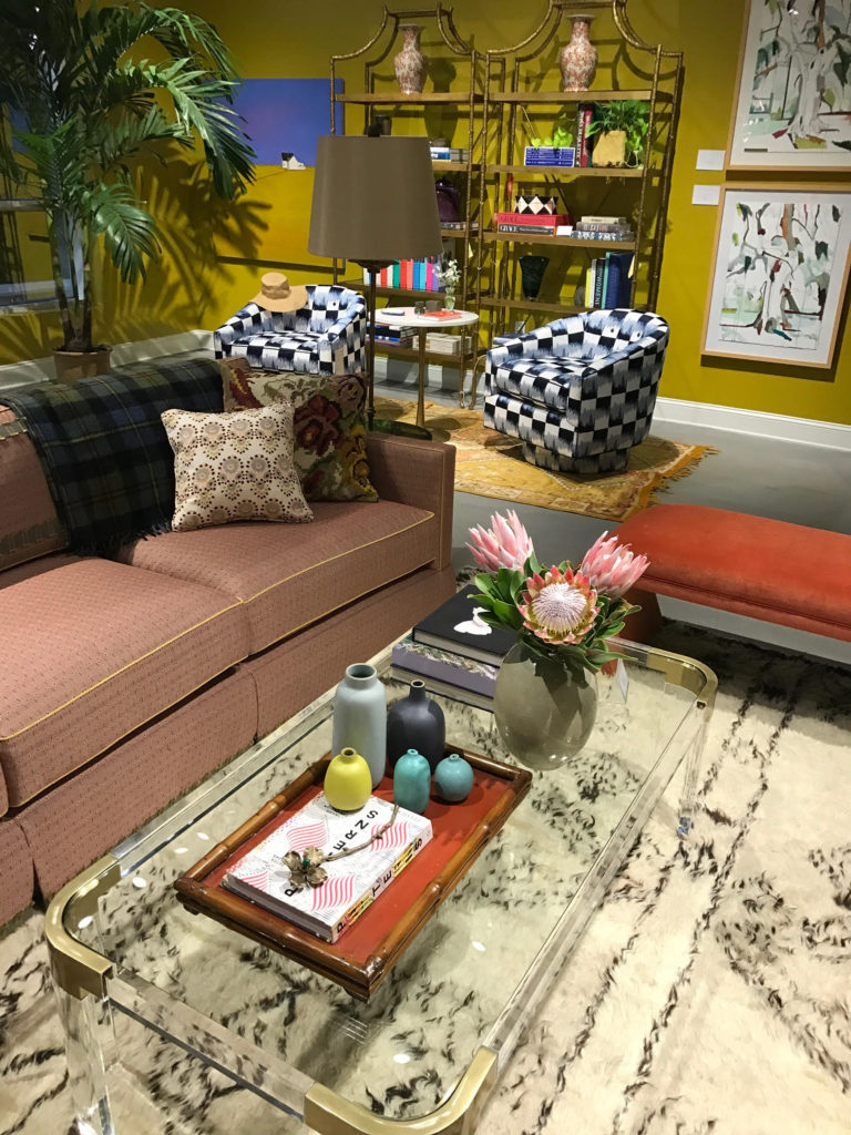
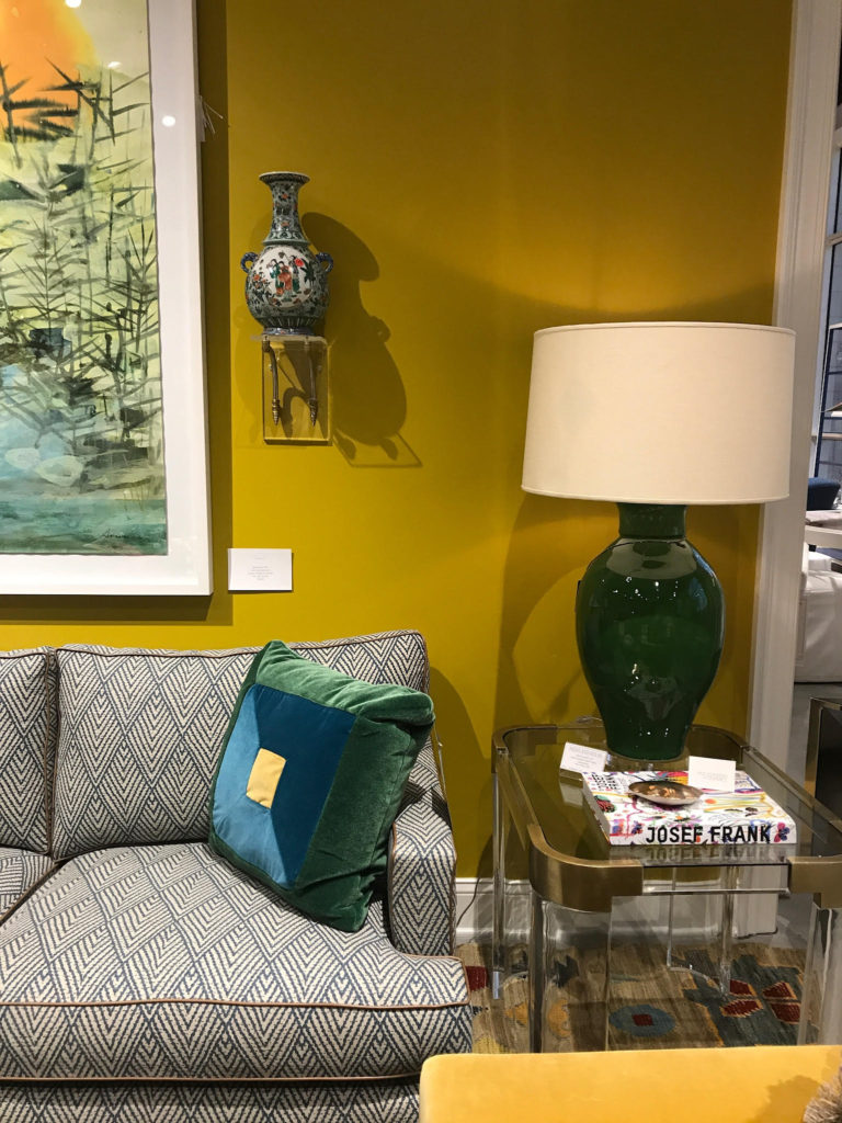
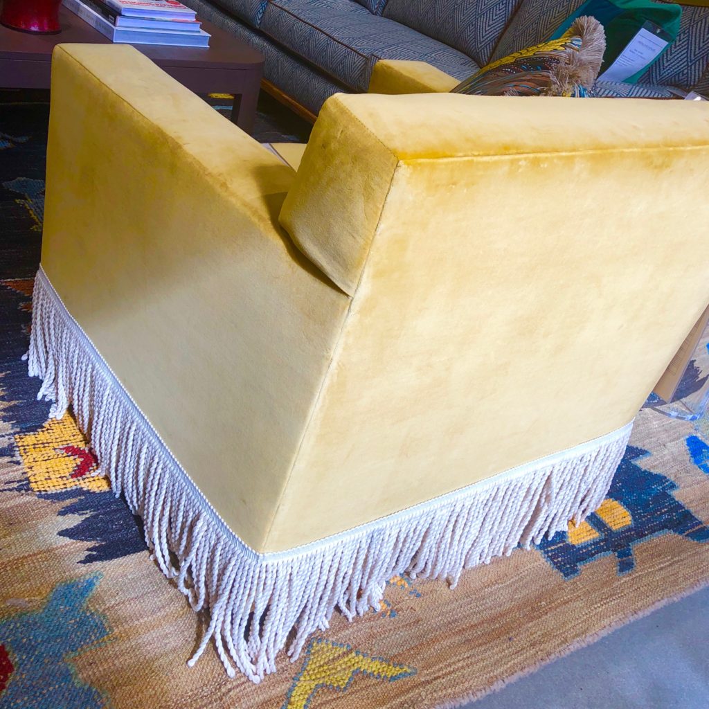
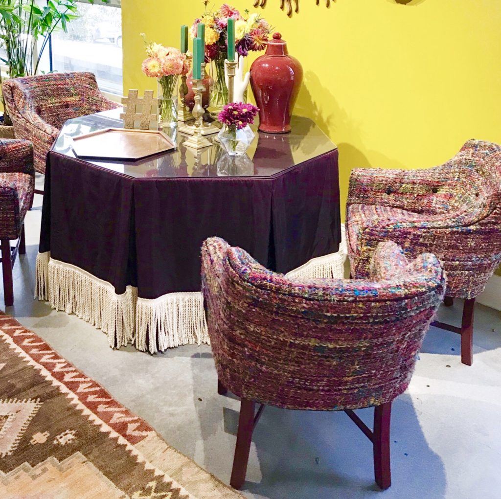
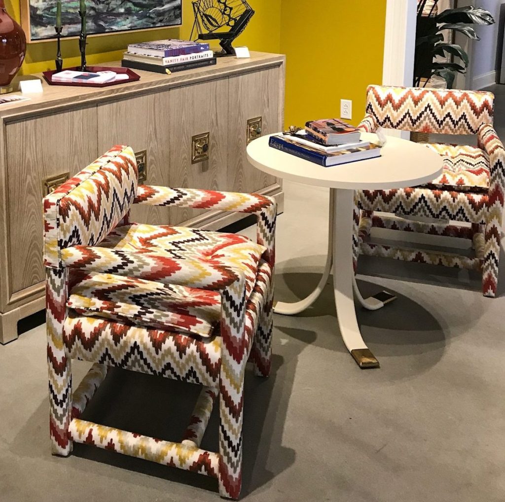
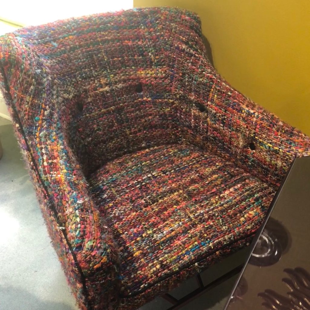
Mixing creativity and upholstery mastery, Highland House teamed up with interior designer Barrie Benson on a capsule collection and designed one of the rooms in their new 200 Steele digs that was a color, texture, pattern, design-lover’s Shangri-La. Just take a look!
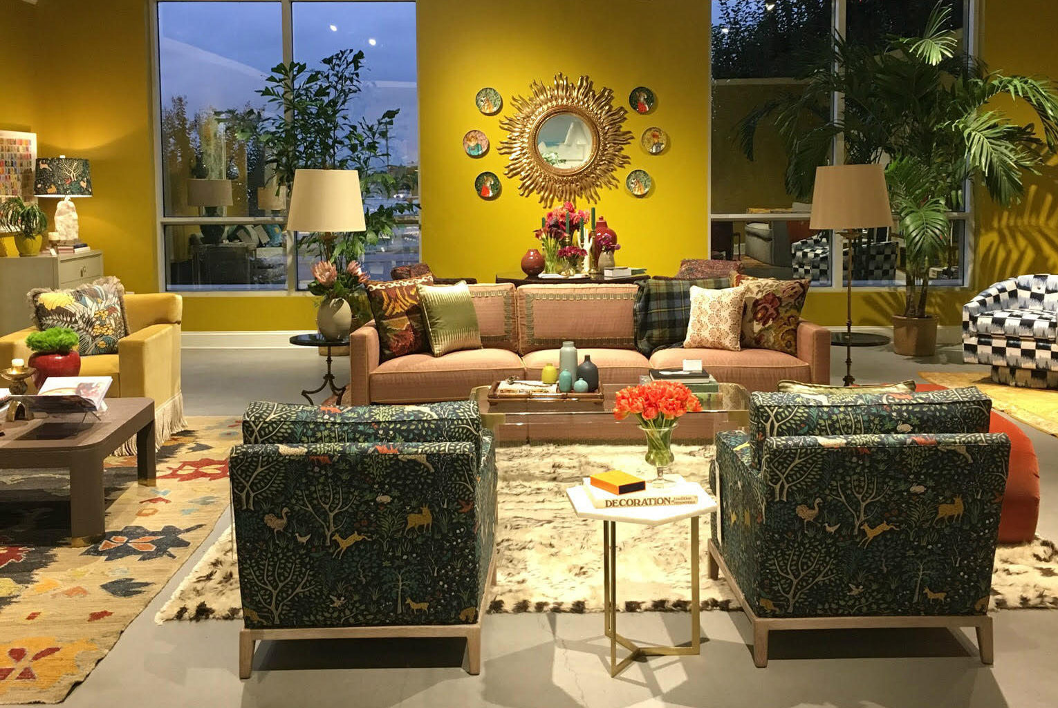
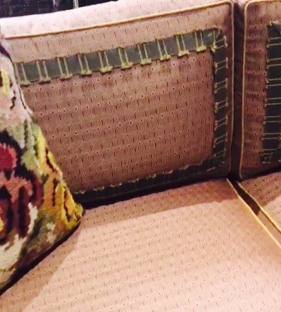
“Fall Market is fun since it can really be about the season and what color is inspiring me at the moment. I like to show different ways to customize my furniture. As a designer, I am charged with interpreting what our client’s love and how they live. I want designers to be inspired by how I change my furniture through skirting, trim, welts and paint finishes so they can customize it to their own personal style.” – Barrie Benson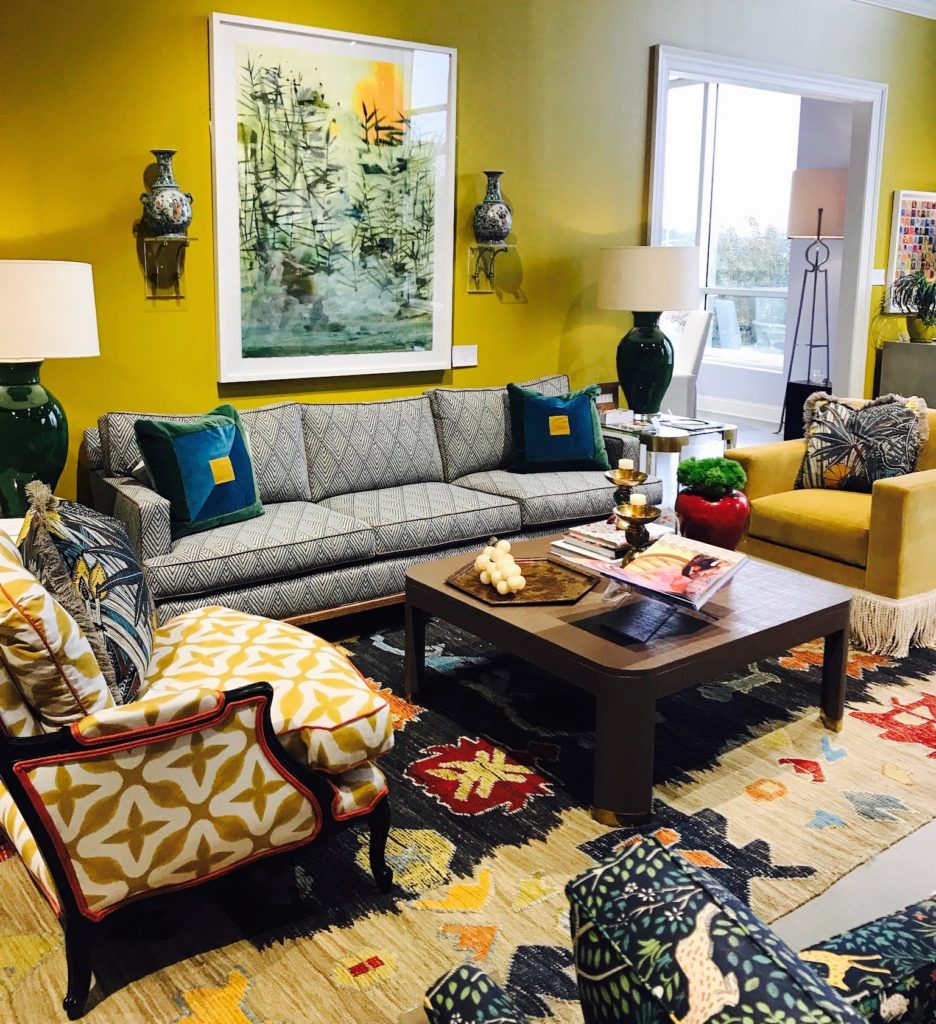
I had the pleasure of speaking with Nathan Copeland, President of Highland House who gave me the insider’s tour of this brilliant collab. Click below to join us on a tour and find out why this partnering was so unique.
Berrie Benson collab w Highland House Furniture
Details close-up! Touring my fave Highland House Furniture featuring Barrie Benson Interior Design October High Point Market | The World's Home for Home Furnishings Esteem Media #HPMKT #DesignBloggersTour #TQxHP Jana Platina Phipps + President Nathan Copeland
Posted by Trim Queen on Wednesday, October 18, 2017
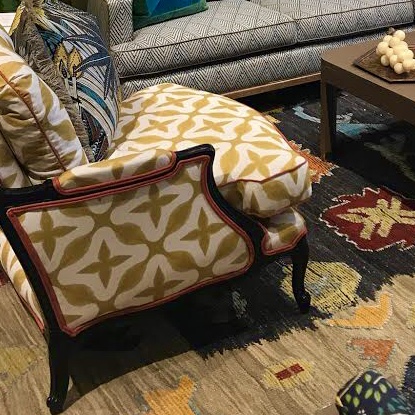
Here are some close-ups of the details that made the space so extraordinary, and in total made me weak in the knees.
So let’s look at some more creative #trimspotting examples that are raising the design bar at furniture market.
CONTRASTING, FRAMING, DOUBLE DIPPING
It’s not politics, it FINE UPHOLSTERY
CONTRAST TRIMMINGS
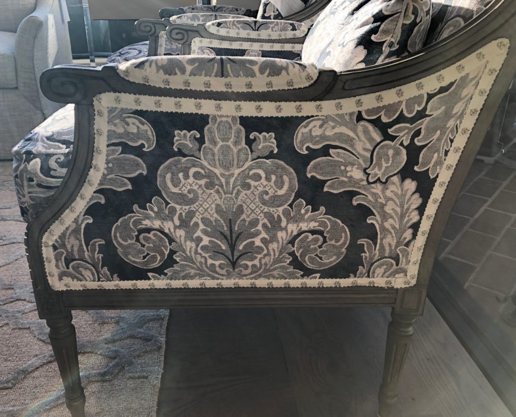
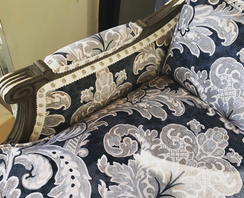
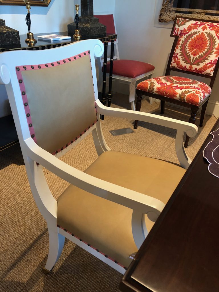
It’s my theory that outlining the furniture frame with a contrast color welt, trim, or nail heads, gives the piece a more sculptural appearance and photogenic appeal. Hellooo Instagram! These are the details our design community loves, and loves to share. First stop Wesley Hall — The Cameron chair, a classic wood exposed club chair is made modern by adding a gimp punctuated by silver metallic hand knots, a decorative alternative to nail heads.
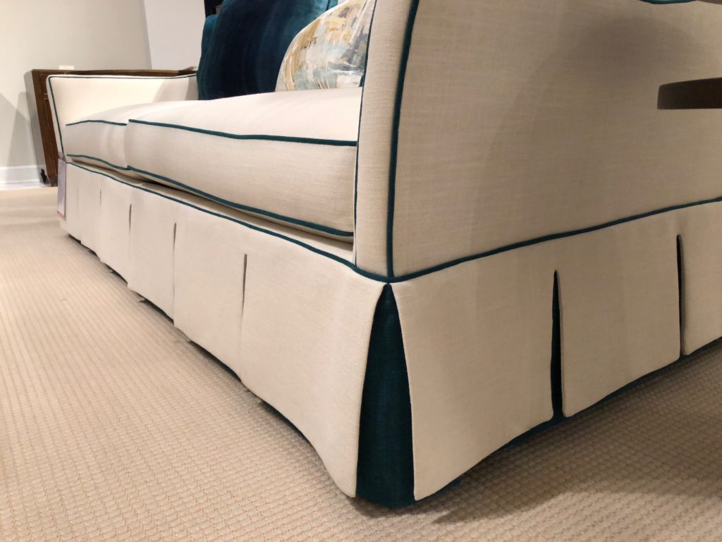
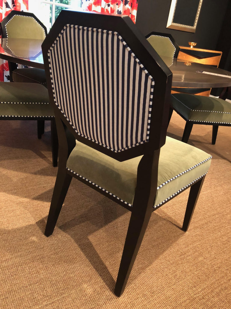
At Ambella Home pieces are outlined in contrast welting to accentuate the lines of the piece. The Worth Avenue Sofa was inspired by Palm Beach’s awnings and umbrellas. Look at the contrasting fabric peeking out from the pleated skirt matching the welt cord, so bespoke resort. Striped fabric is made into welting to give this Mary McDonald dining chair, the Chantal, added style at Chaddock.
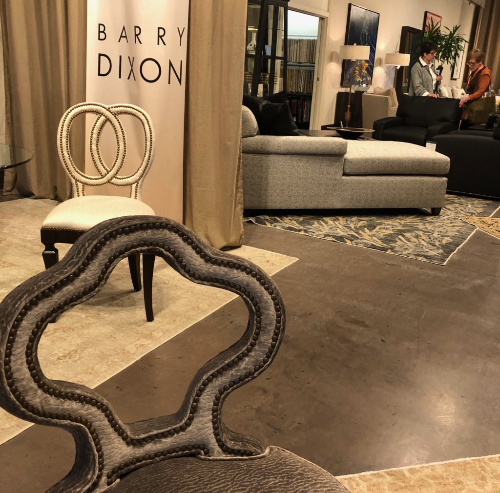
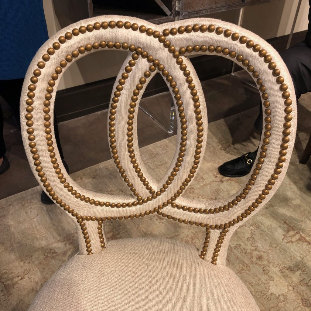
Prolific interior designer Barry Dixon welcomed the Design Bloggers Tour to Tomlinson. His joie de vivre was infectious as he pointed out all the incredible custom work executed for his furniture collection. Barry shared his idea related to these open back beauties, “We wanted these chairs to be relatives to their design origins, but to be a fresh take on a traditional silhouette. For example, the Albemarle chair was based on the wooden carved back of the Georgian period original I found in Albemarle County, VA, but the new back is upholstered to be more comfortable than its all-wood ancestor. ”
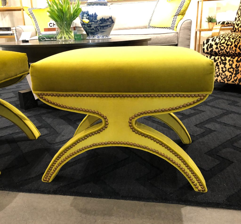
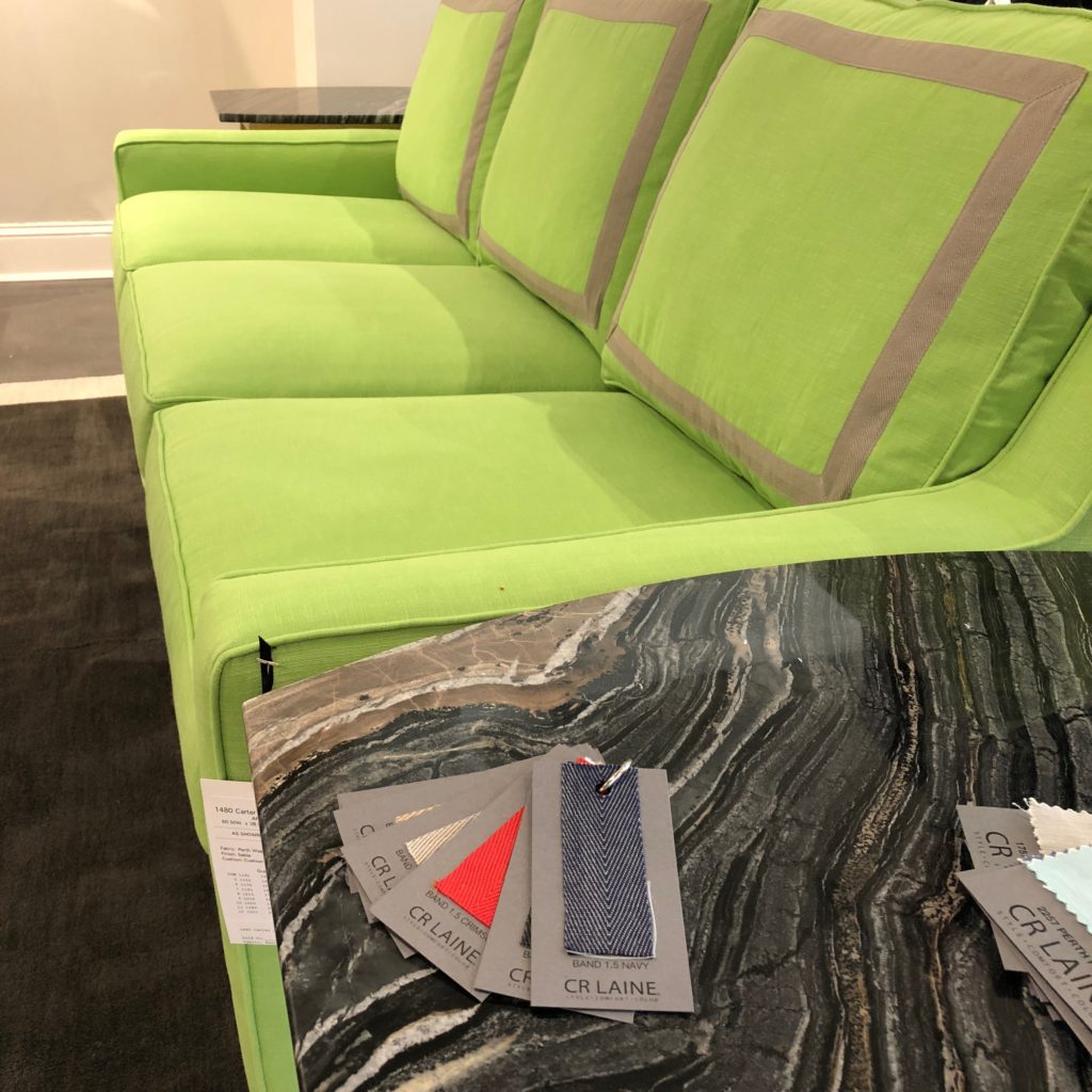
From CR Laine, Marge Carson and Norwalk, nail heads continue to emphasize shape.
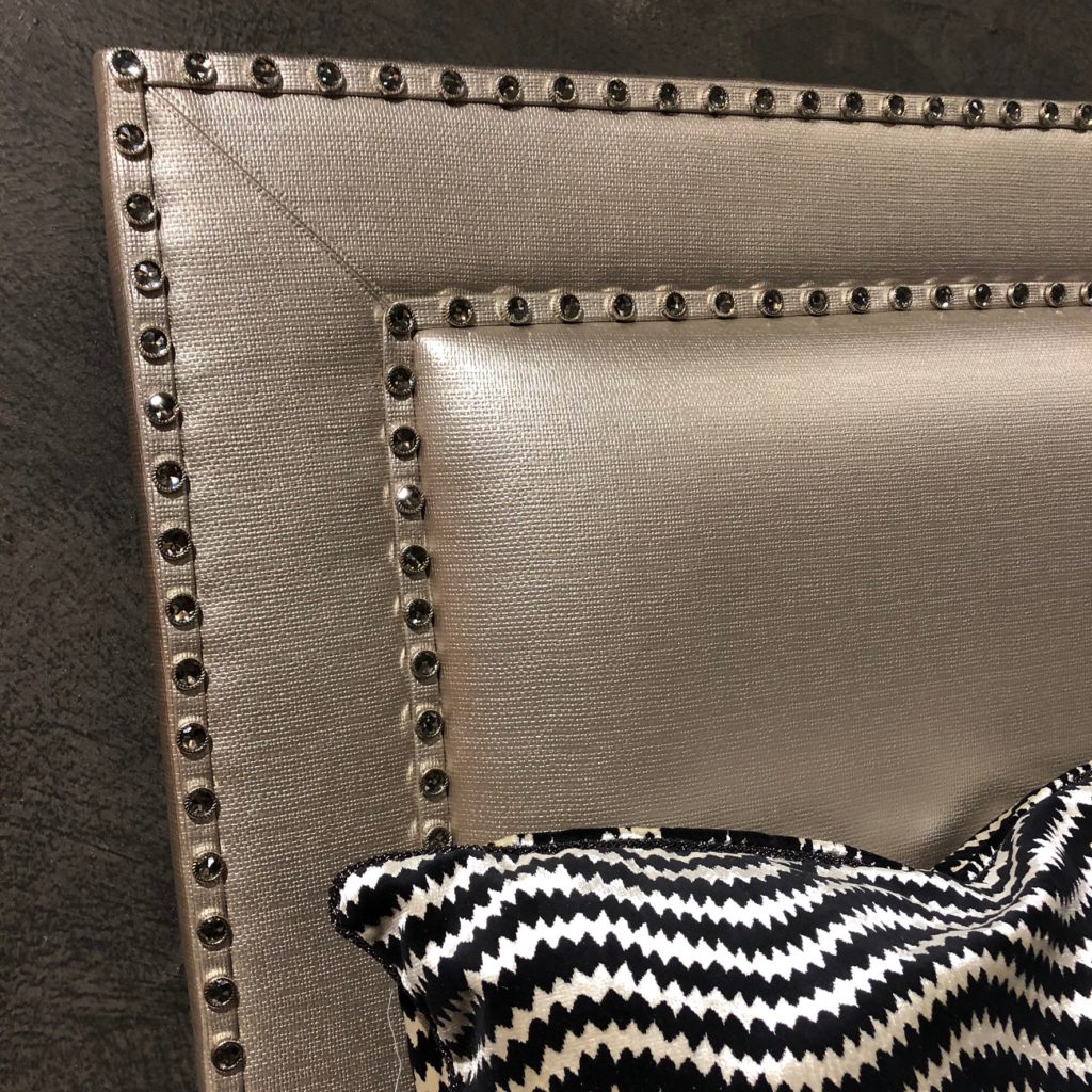
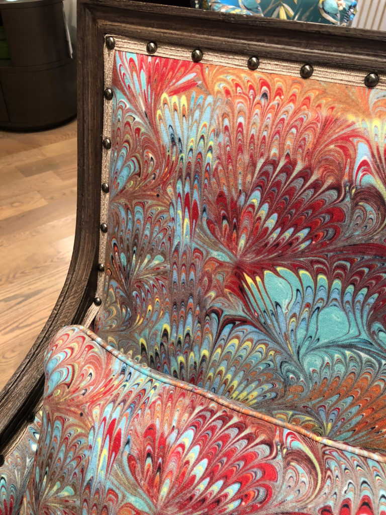
At Hickory Chair and Wesley Hall, tape trim under spaced nail heads add dimension to these chairs. Artist Jill Seale translated her artisan technique of marbleizing paper to printing her artwork on fabric for a collab at Wesley Hall.
PICTURE FRAMING
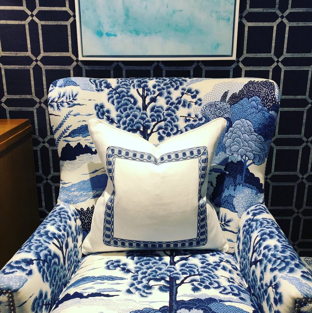
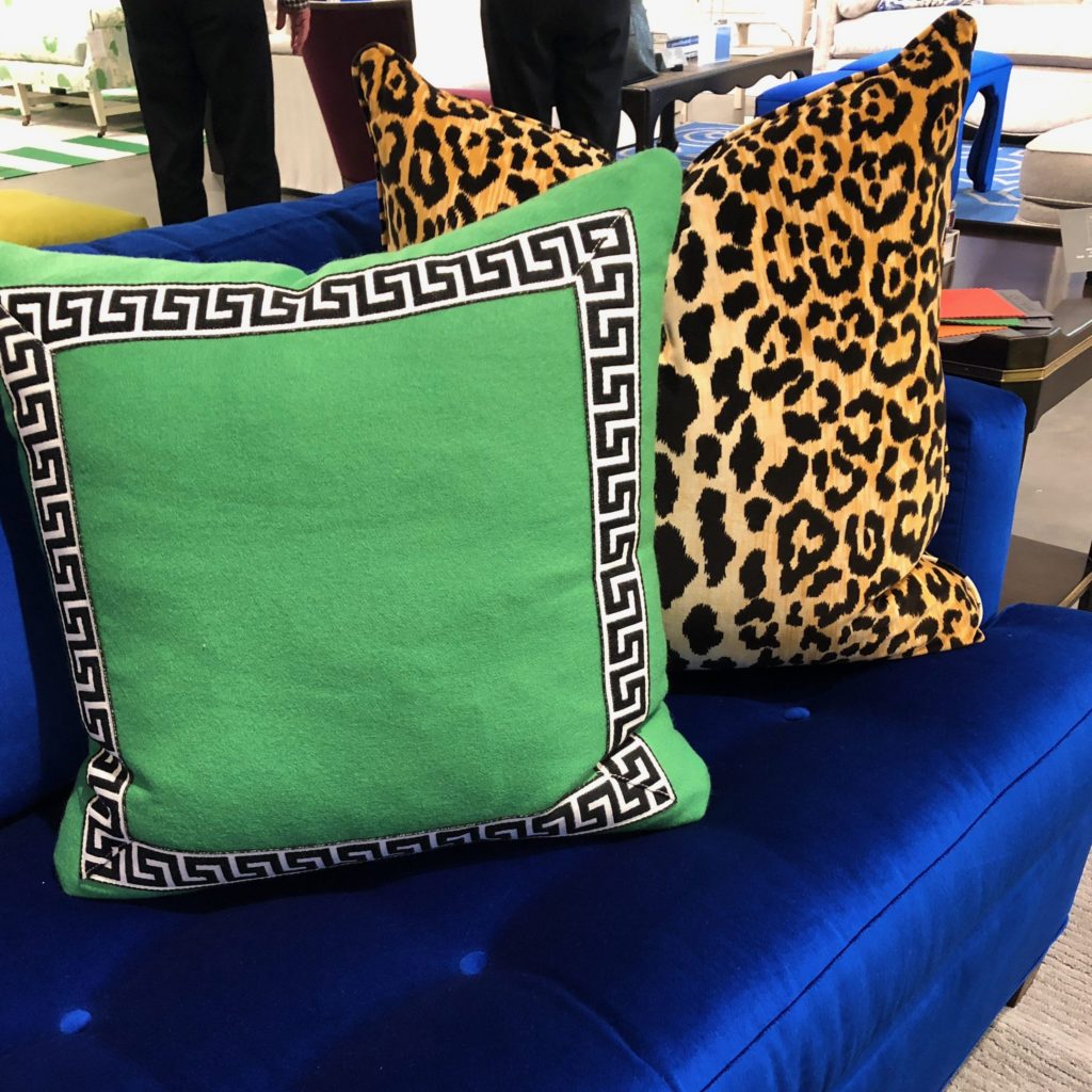
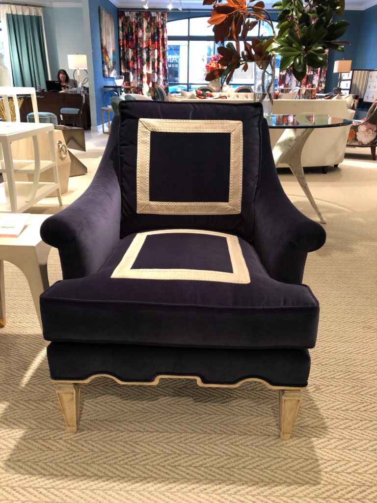
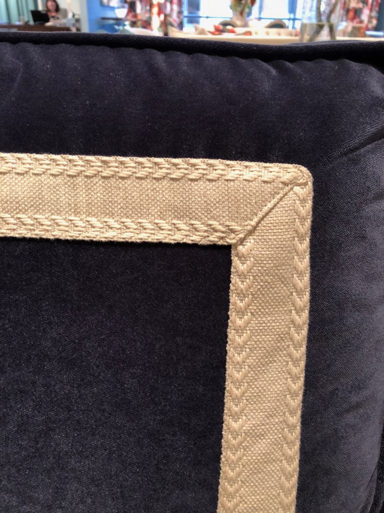
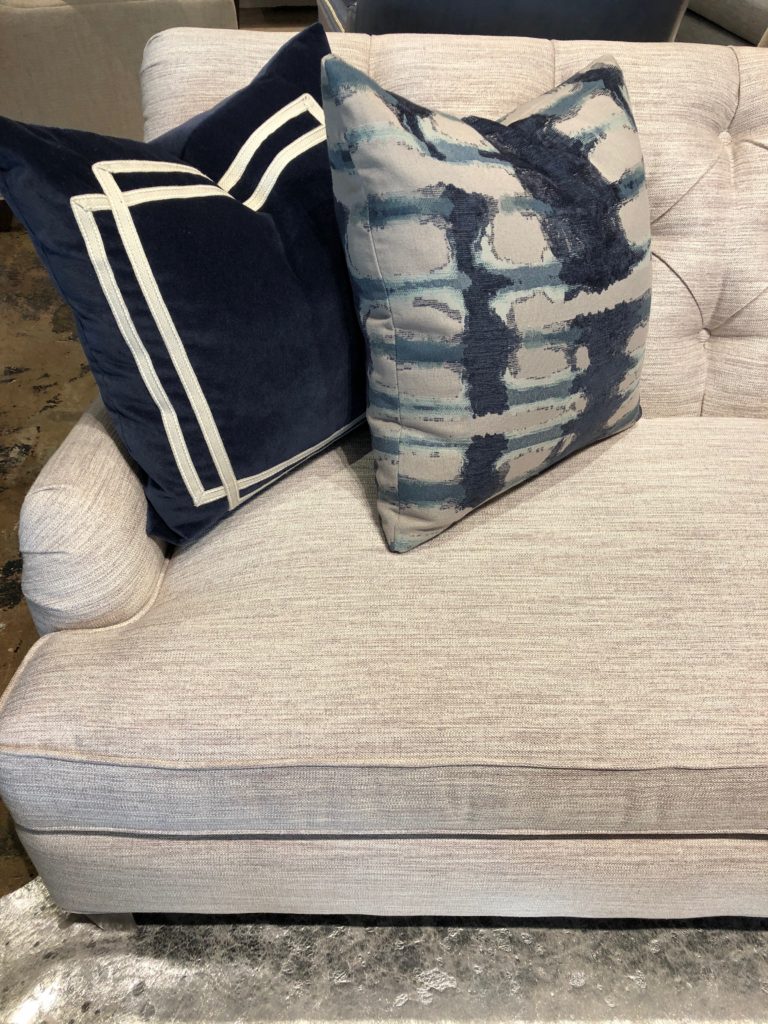
Picture framing technique is applying a flat tape inside the outside edge of the cushion, pillow or seat of upholstery. Again, the graphic impact jumps off the screen. This is a very designer detail that manufacturers are noticing and employing for “look at me” appeal.
DOUBLE DIPPING
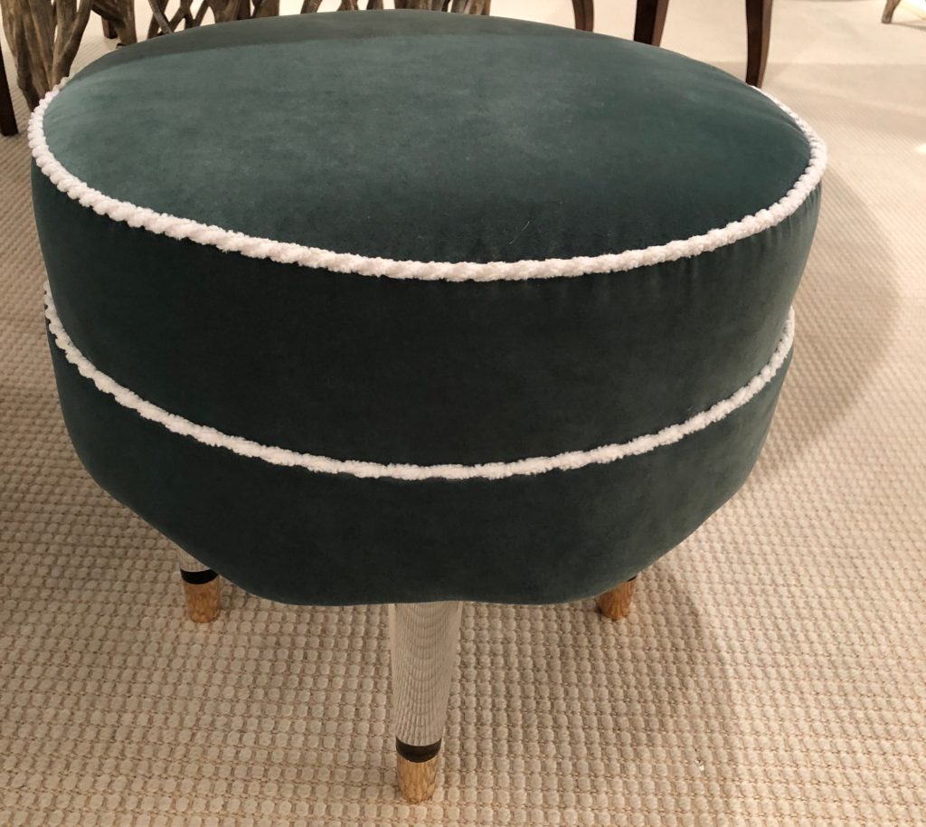
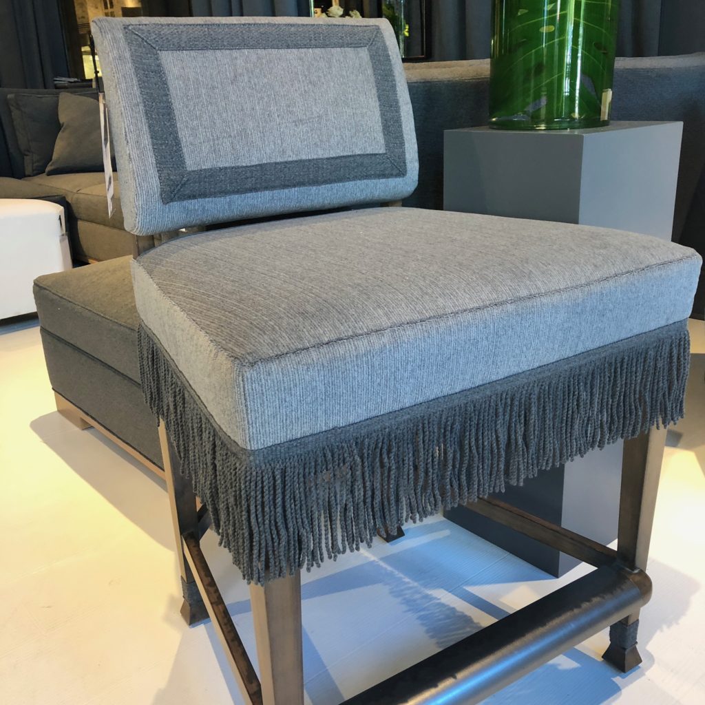
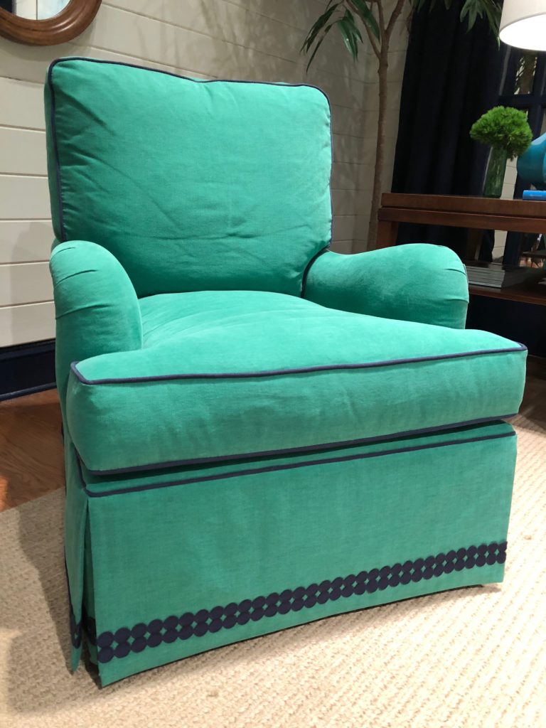
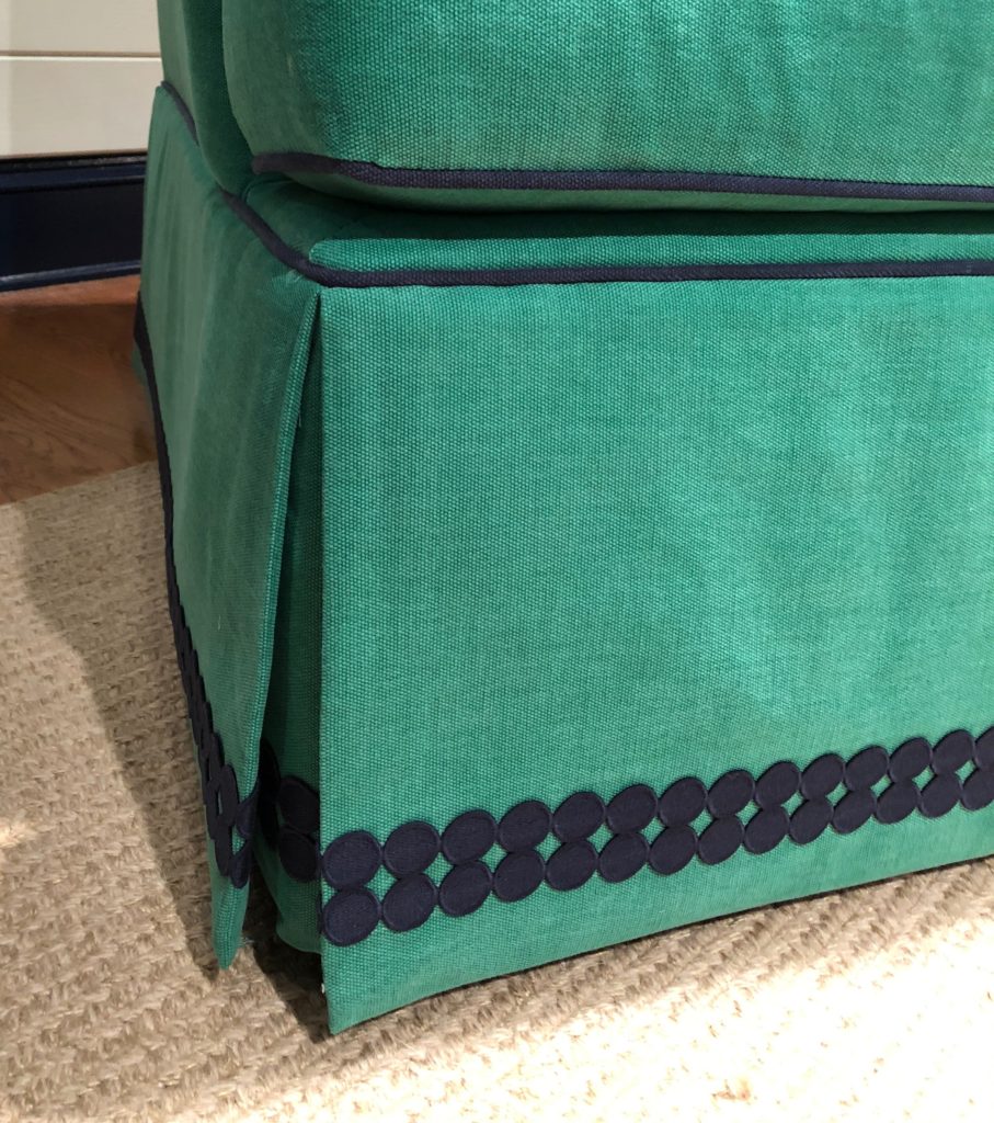
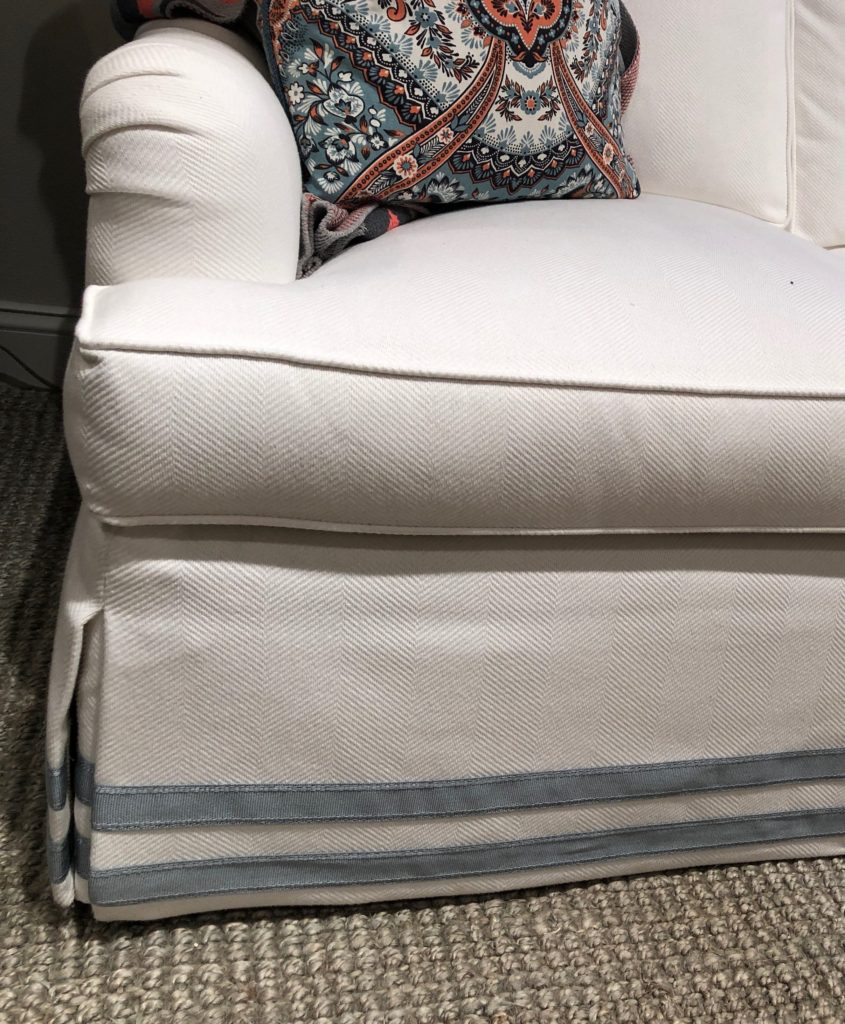
Wide banding tapes have been popular on the leading edge of draperies and seen on sofa skirts for a while now. Evolving from that, I noticed this market smaller scaled trimmings used double. The dot applique was designed as a double row but the other twill tapes, ribbons and bandings were applied doubly for impact, love this!
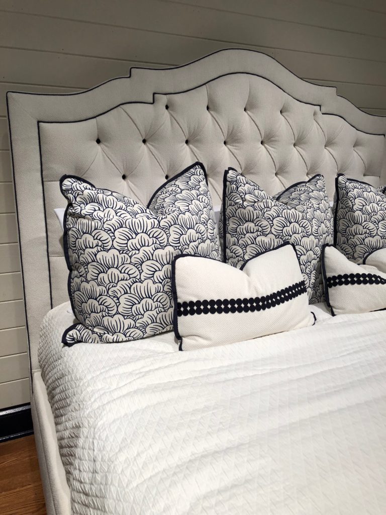
Spotted at Taylor King, pardon the pun, is a double dot applique on the skirt of their brushed cotton upholstered Plymouth chair (with contrast piping I might add). They also used this trim on beautiful bedding accenting their Taylor Made Bed. Both of these pieces could fit into the CONTRASTING category too, aren’t they so graphic and photogenic? One lucky winner will receive a custom made bed from the Instagram contest they ran at market. I can’t wait to hear who won!
At Century, VP Creative Director Ron Fiore designed a fabrication of topstitching double tapes on solid fabric for stripe effect. He calls this “custom taping”. See how it is sewn perfectly over the cushion welt? That’s amazing workmanship. Click below for a 360 degree view.
Century Furniture tape trim detail on chair
#trimspotting Look how this banding transforms the Grayson chair at Century Furniture and look even closer how it is even toostiched over the welt. MASTERFUL!! #TrimAlchemy
Posted by Trim Queen on Tuesday, October 24, 2017
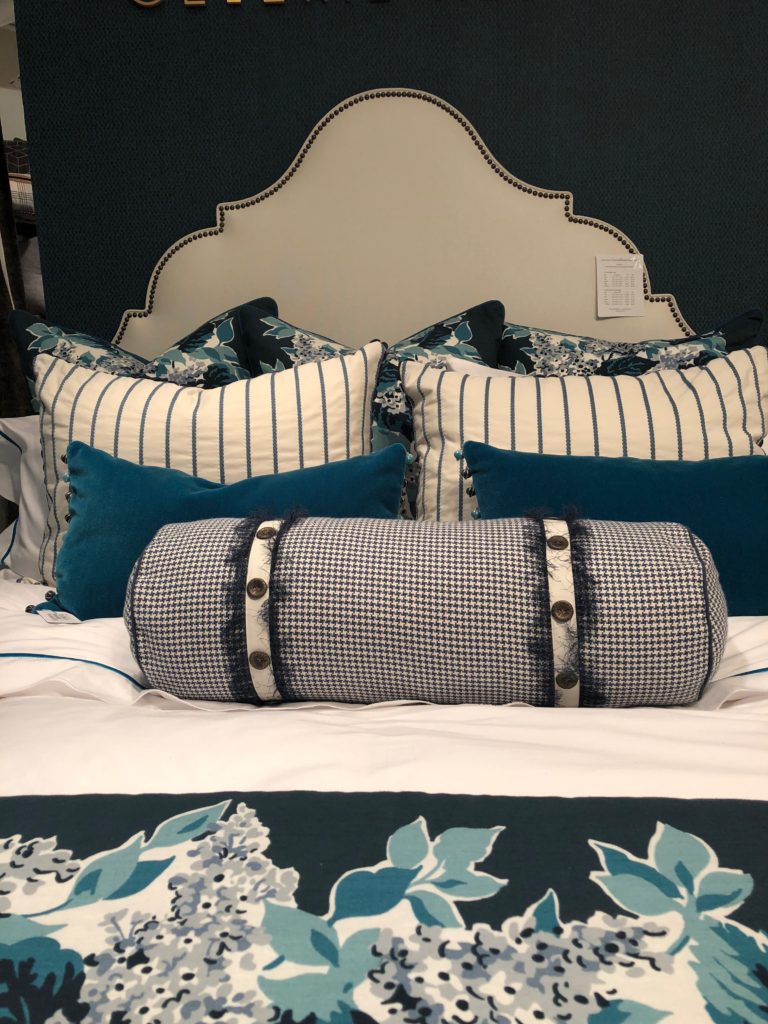
I love the symmetry and trim details of this Celerie bed at Eastern Accents. I got to learn all about her thoughtful design process and her new collaboration last market, you can read more here. Both Wesley Hall and Massoud doubled tapes in lieu of wider bands. Congrats to Massoud celebrating 50 years in business this market.
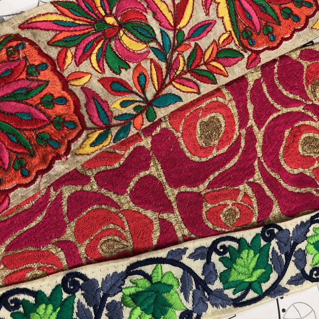
And talk about some of the most colorful tools of the trade, did you see Trellis Home trim launch at Pyar & Co? I can’t wait to see how desiners will be using these in future projects.
If you were at High Point Market and saw additional trim fabrication trends that wow’d you, I’d love to hear about them. Drop me a line in the comments below. I hope the ones illustrated here further your interest in these companies or inspire you to use trimmings in new ways. Keep a look out for my next HPMKT post celebrating female ingenuity and highlighting a few more praise-worthy Design Bloggers Tour stops. Until then, keep #trimspotting!
***This is a partially sponsored post however all observations and opinions are my own.

2 COMMENTS
What lovely furniture fabric prints you’ve featured Jana. I like the mixing blues, and pattern, from the new Barclay Butera. It’s a calm hue and it’s perfect chair to read my favorite book. Anyway, I was looking for ideas in picking printed curtains. Do you have any advice about curtain prints?
Thank you Nadya, I agree the Barclay Butera collection for Lexington Home Brands is spectacular. Thanks for reading!- Jana
Comments are closed.